Iconography
Used only when they provide significant value or support, never for visual ornamentation
It is very important to maintain iconographic consistency, otherwise everyone will use the ones that best suit their visual criteria, and this can greatly compromise the coherence of the site as a whole.
Downloadable icons
The following icons belong to the icons used on the new website and should therefore be placed on other assets and media.
A downloadable sample is attached below, followed by instructions on how to generate icons that do not appear in this sample.
ADd
Attach file
attachment
book
bookmark
calendar
chat
chat 2
radio button
radio button checked
checkbox filled
checkbox
check bold
check thin
clock
close
copy
credit card
dollar
euro
duration
file
folder
filters
flag
globe
graduate cap
hide
show
info
label
list
location
location
unlock
lock
menu
minus
more - bold
more
more - vertical
percent
phone
priority
question
remove
save
share
search
shield
verified
badge
sort
sort 2
sort 3
sort 4
user
user 2
user location
error
warning
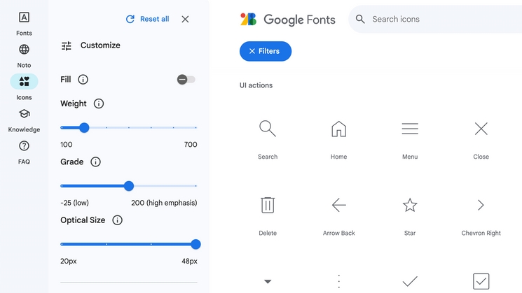
How to make a new icon?
The inverted comma icons belong to Google's"Material" - Google Fonts.
To generate an icon that is not included in this library:
1 - Go to this URL
2 - Make sure that the following values are set in the panel:
Fill: 0 (or disabled) |Weight: 200 | Grade: 0 | Optical Size: 48px
(screenshot attached on the right)

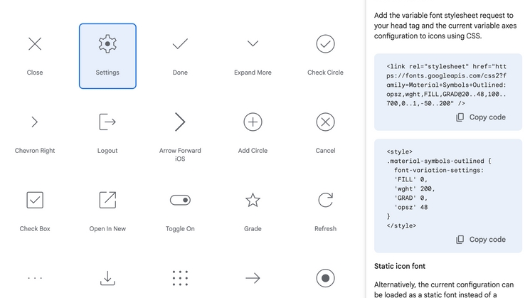
3- Type in the search bar the key word to search for the type of icon you need (For example: home, arrow, user, close....).
4 - When you find the right one, click on it and you will see a side panel appear on the right-hand side. This panel shows code and instructions for embedding it in any page, but you can download it directly
in .svg or .png to upload it manually to Griddo in the same way you upload any image.
5 - Attach the new icon in this library, in its corresponding section (screenshot attached on the right).

Misuses
We will have to keep the coherence and consistency of the icons, as well as the brand colours or typographies.
To this end, we list some examples that would not be valid and would not fit in our designs.
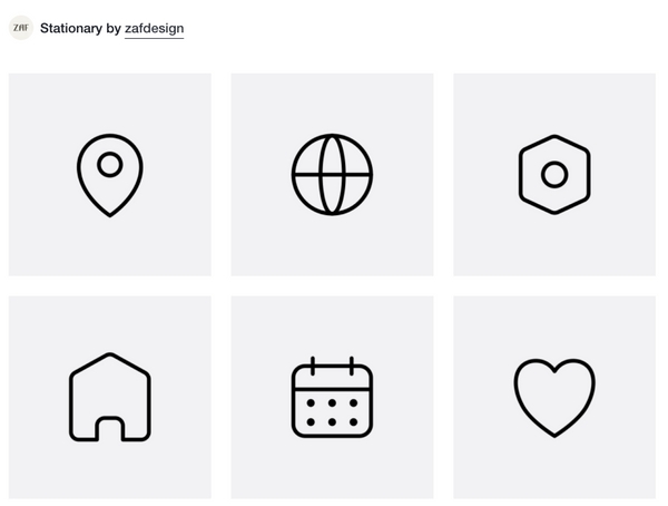
Other typeface families
We should never use icons from other typeface families or fonts, however similar they may look.
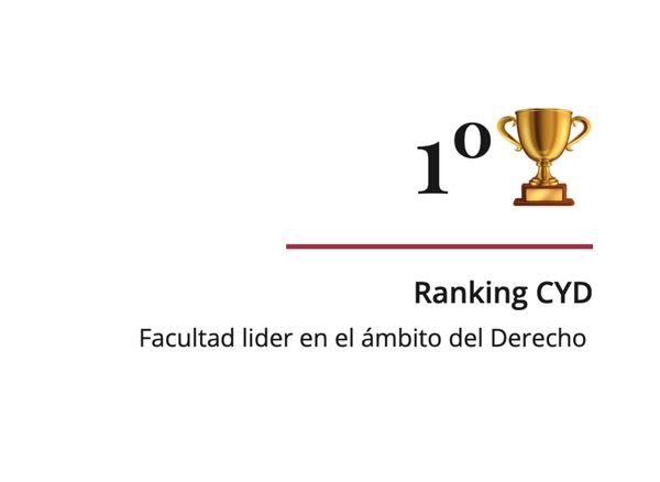
Use of emojis
We should not use emojis or any other type of image or avatar, as this would lead to inconsistency and visual incoherence.
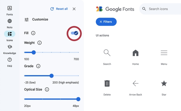
Filled icons
Icons with filler should not be used, even if they are from the same family.
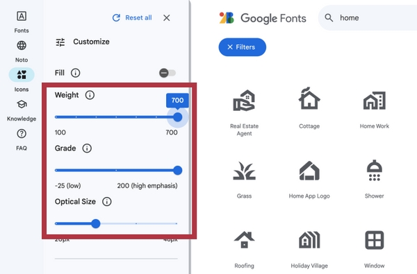
Other properties
We should not use properties outisde those indicated. For example, more thickness or less "Optical Size".